COMPANY

CI TYPE

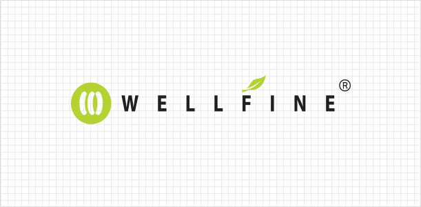
1. horizontal logotype

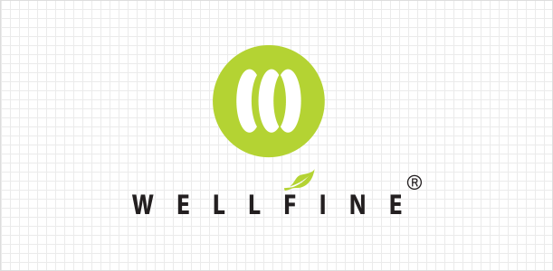
2. vertical logotype
CI STORY
The green circle symbolizes
our commitment to a healthy life and
a dedication to sustainability through nature.
The green circle symbolizes our commitment to a healthy life and a dedication to sustainability through nature.


“It doesn’t get better than this.”
This phrase perfectly captures Wellfine’s vision.
Our name, a blend of ‘WELL’ and ‘FINE’, carries our core message:
To do things the right way, and to do them well.
COLOR SYSTEM
Our primary color, Apple-green reflects cleanliness, freshness,
and our unwavering integrity as a company.
It evokes a sense of natural harmony and vitality — a symbol of our eco-conscious direction.
To complement the bright and energetic main color,
Silver and Black have been chosen as sub-colors, providing a refined and stable contrast.
Together, these colors represent balance, sincerity,
and Wellfine’s desire to resonate with people in an honest and harmonious way.
WELLFINE Apple-green
C39 M0 Y99 K0
R152 G195 B31
WELLFINE Silver
C31 M24 Y23 K0
R187 G187 B187
WELLFINE Black
C0 M0 Y0 K100
R0 G0 B0
